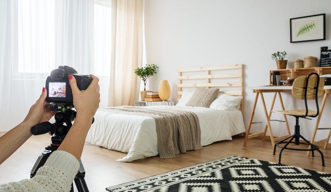
(TNS)—Whether you’re showcasing your home for a rental, sublet, new roommates or sale, great photos are essential to attract attention online. We asked Alyssa Rosenheck, a photographer, home stylist and author of the forthcoming book “The New Southern,” about how anyone can take better photos of their home.
Here are her suggestions for amateur photographers:
Level up. A classic rookie mistake is expecting superstar results from holding the camera by hand. Invest in a simple tripod for your DSLR (digital single-lens reflex) camera or an attachment for your camera phone. Straight lines are like oxygen for clean imagery. The viewer’s eye immediately catches and focuses on any crooked lines. But straight lines—horizontal and vertical—will create a chorus among the composition that sings. Hence, the need to level up and have a tripod.
Think about the lens figuratively and literally. First, set an intention through your own personal and emotional lens. Each room has an energy and a story to tell. This is your chance to share the story of the spaces that have supported you and continue to inspire your path. Second, invest in both a good prime and wide-angle lens. One of my favorite prime angle lenses is a 50 mm because this lens is most representative of what your natural eye sees. My goal as a photographer is to communicate the stillness of space while transporting you into the room with me as I experience it.
A prime lens means you have a fixed focal length, which really motivates you to move around the space and find the perfect frame for the shot. Wide-angle lenses are important in capturing the scale of a space. Renting lenses is a great way to try out a variety and see which feels most natural to you. And for phone photographers, there is a variety of affordable wide-angle lens accessories for on-the-go.
Let there be light. Natural light, that is. This is essential for capturing the most accurate representation of a room as possible. It is camera versus eye, and not all cameras are created equal, especially in comparison to the vast dynamic range of our eyes. I am known for bright, crisp images, so it always surprises my clients and followers when I methodically flip off all light switches as we begin photographing a space. It may be counterintuitive, but it yields the most accurate representation of the room’s color and all the beauty within it.
Be a straight shooter. I am a back-to-basics kind of woman in every area of my life, especially when it comes to angles behind the lens. Let’s keep things simple and shoot straight-on. This will yield beautiful, clean lines and communicate the composition of the space. Overly complicated angles result in fussy images and confusing focal points.
Layer on. An image is technically flat, but what makes it come to life with great dimension are its “layers.” The rooms you are shooting need to communicate to the viewer. So, tangibly, there needs to be an element of visual texture to the space for it to have dimension. Ways to add layers include decorative tabletop accessories, mirrors, layered artwork leaning against a wall, layered rugs, texture-rich throws and fabrics, and flowers picked from the garden. Pro Tip: Leave the red roses at the store and stick with a neutral color palette, such as whites, greens and blushes. This color palette will keep an image fresh and attainable without being season-specific.
Prop with proof of life. When styling for shoots, I add an element of practical fantasy to each space, but it’s important to keep it as natural and minimally invasive as possible. I call this “proof of life.” Use it as an opportunity to highlight the history of the home or honor the character of the client. Some of my favorite tools for introducing proof of life are an open book on a desk, fresh florals on a kitchen counter, branches to add textural layers to a bedroom, a simple necklace coming out of a jewelry dish to showcase depth, or fruit falling from a bowl as an element of interest.
Keep composition simple. I find composition to be much more important than the camera you have in your hand. It enables the space’s story to be told through object arrangement and placement. I can communicate a particular object of interest through my focal point or, alternatively, introduce a moment of relief by emphasizing the negative space. There are numerous theories behind composition, but at a basic level, your goal should always be to achieve straight lines and balanced layers and let the rule of thirds guide your lens. (The rule guides photographers to place the main subject off-center.)
©2019 The Philadelphia Inquirer
Visit The Philadelphia Inquirer at www.inquirer.com
Distributed by Tribune Content Agency, LLC


